Flare
Bitso's Design System.
Reading time: 3 minute(s).
The challenge
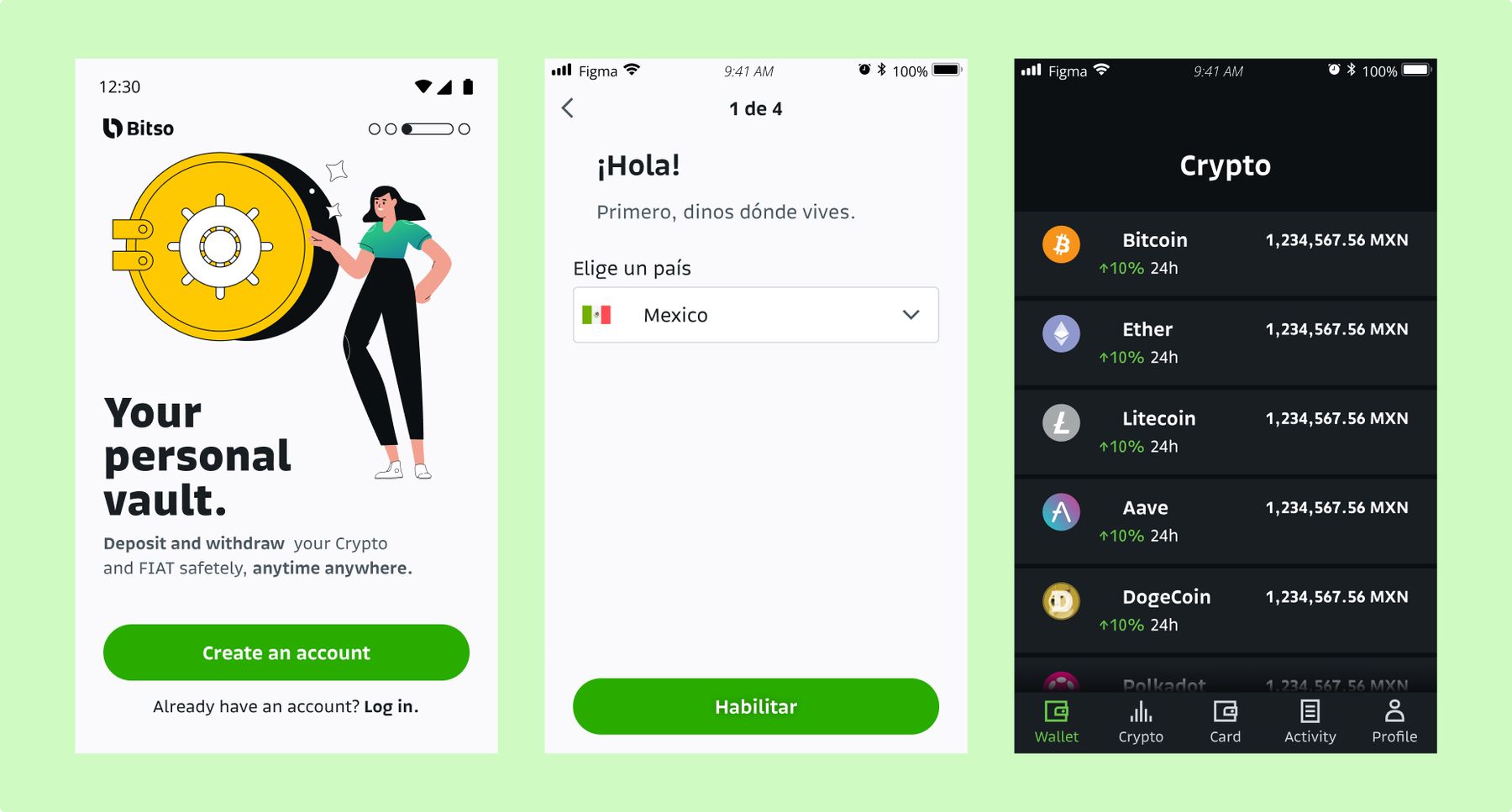
Ever since Bitso became an international brand there was a need to improve the visual, content, and brand consistency across products and platforms.
The basics
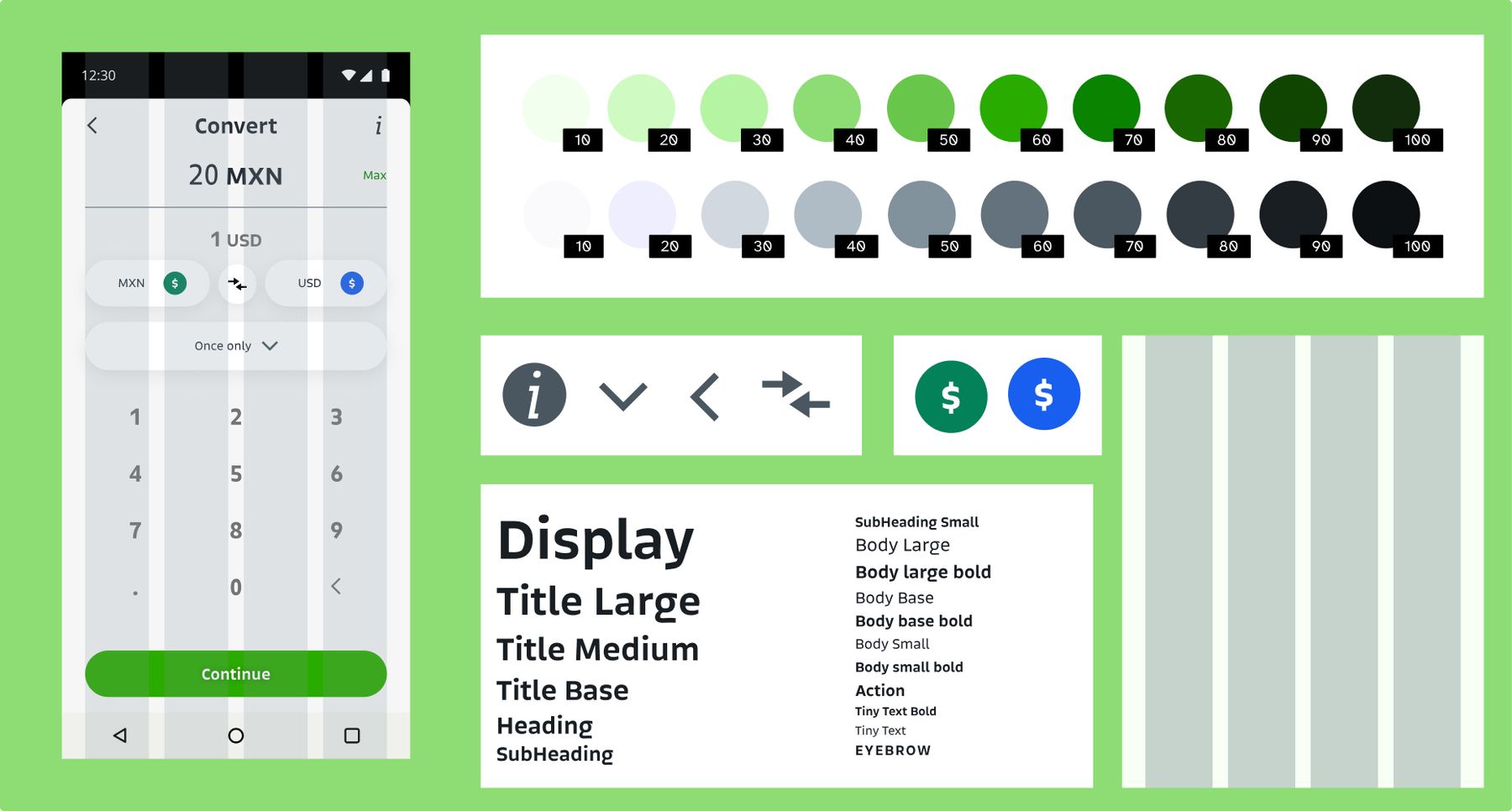
The first thing we needed to do was establish our Design system foundations.
These foundations represent Bitso's Design Language through basic guidelines for designers and developers to make informed decisions about style for creating anything, from a button to a full page that are consistent with each other.
Light and dark mode
After gathering our colors into a main palette, we organized them into theme-like structures so you could change between light and dark modes really quickly on every platform.
The components
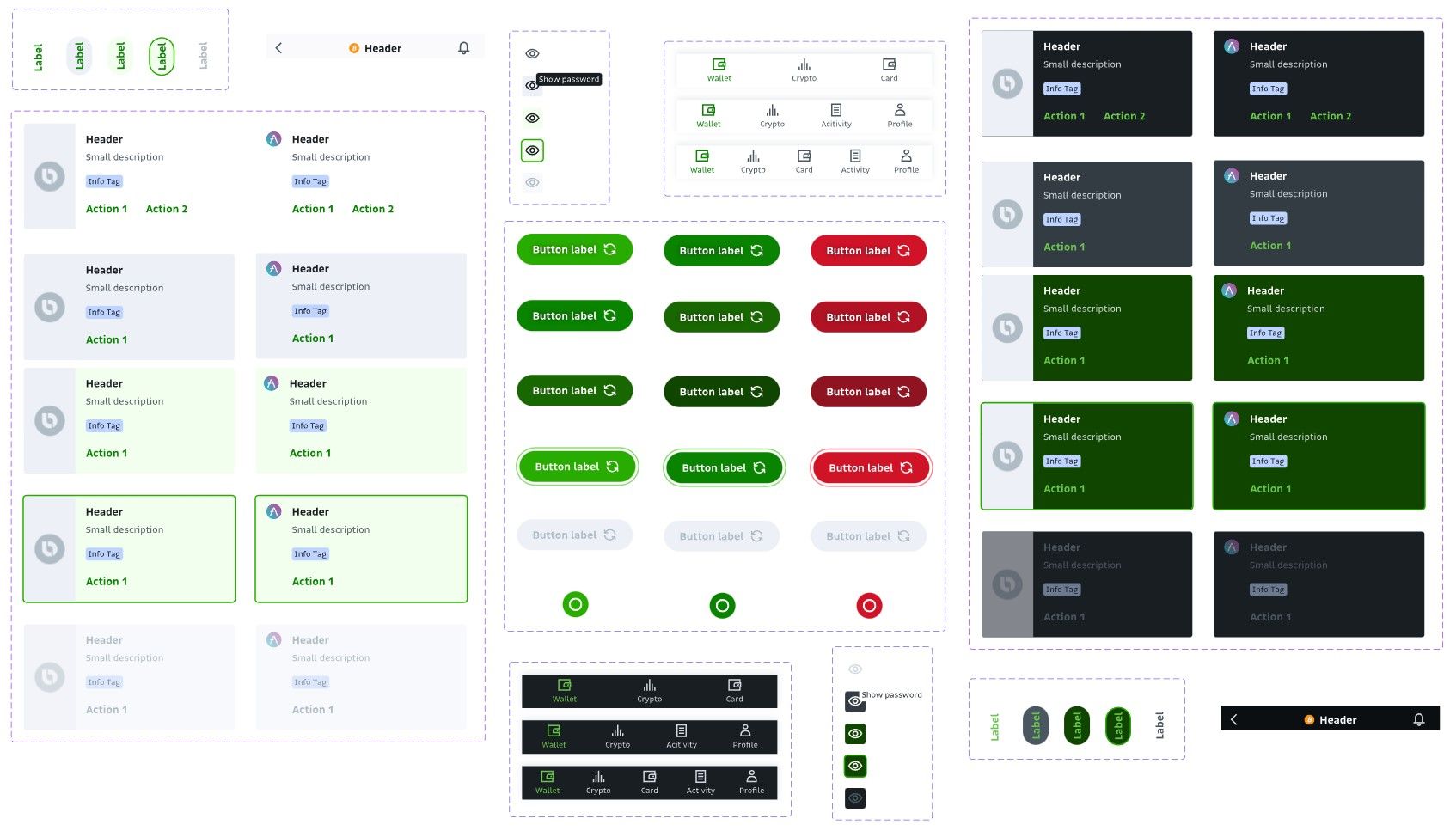
Once the foundations were established, we started creating components for the mobile app and for the website — each one following the best practices in terms of accessibility and UX. Thanks to our theme structure, these components can function in dark mode out of the box with no issues.
Illustrations
For the illustrations, we decided to go with simple shapes so that characters could be created and animated easily with a color palette that originated from our main brand colors.
The Flare inspector
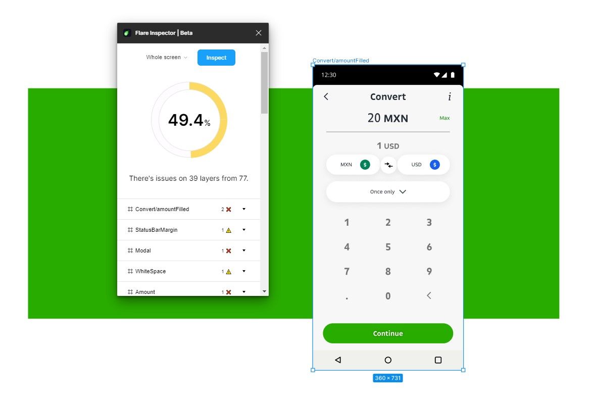
The Flare inspector is a Figma plugin I created to increase the adoption of the design systems on other squads, it can tell you the things that do not align with the Design System guidelines in your specific design and how to correct them.
The end result
Flare was an incredible challenge about scaling a Design System to serve different teams on different platforms, each one with it's own little identity that branches from the main brand but that feels as part of the same family.
