Iris
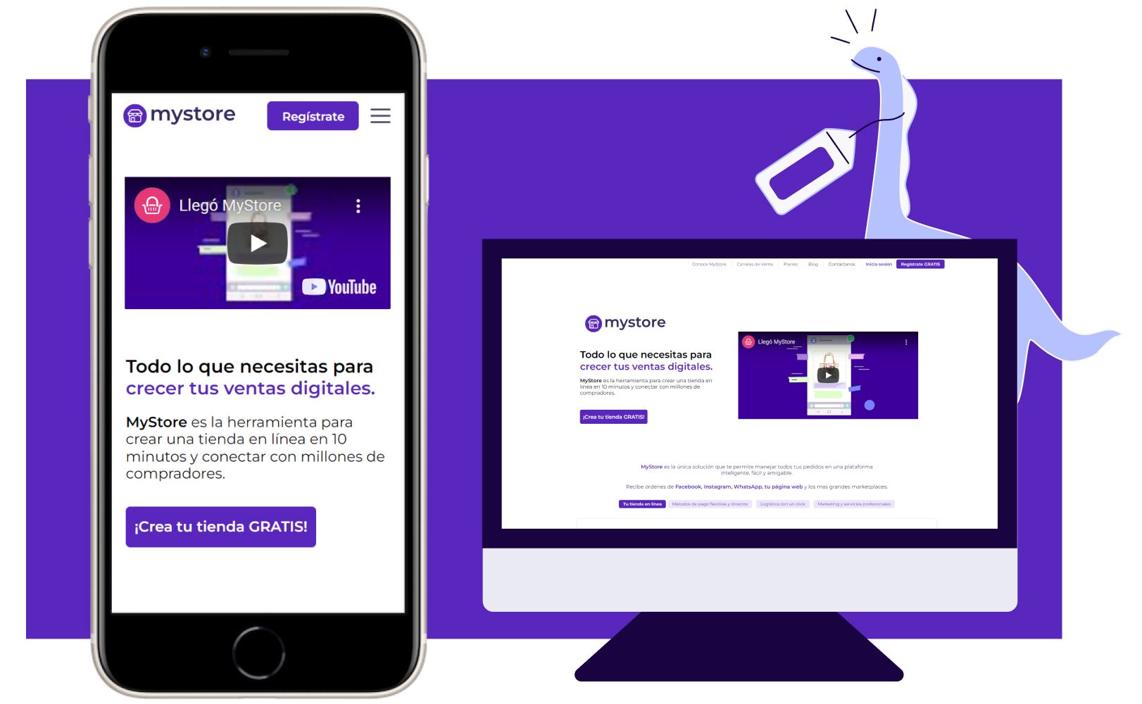
A design system I designed for My Store, Canasta Rosa's sibling product.
Reading time: 3 minute(s).
The challenge
My Store was Canasta Rosa’s sibling service.
It was created to serve as a robust hub where you could connect to all of Mexico’s major e-commerce platforms.
The idea was to create a service that would share similar UI characteristics with Canasta Rosa but with a fresh, cleaner look.
From MIJO to Iris
We decided to make things right by creating the Design System in
parallel to the creation of the MVP of the service.
Thankfully, since the look should be similar to that of Canasta’s,
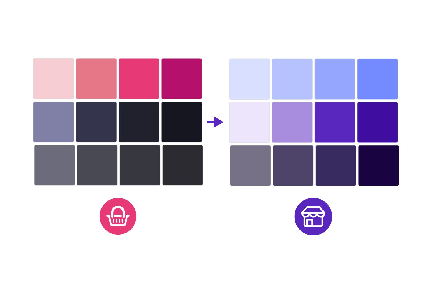
we reuse the same structure as MIJO(Canasta’s Design System) but with a purple spin to it.
Fun fact, the Design System is called Iris, because of My Store's
purple color and because is also an acronym for (Incredible Reusable Interface System).
Updating old components
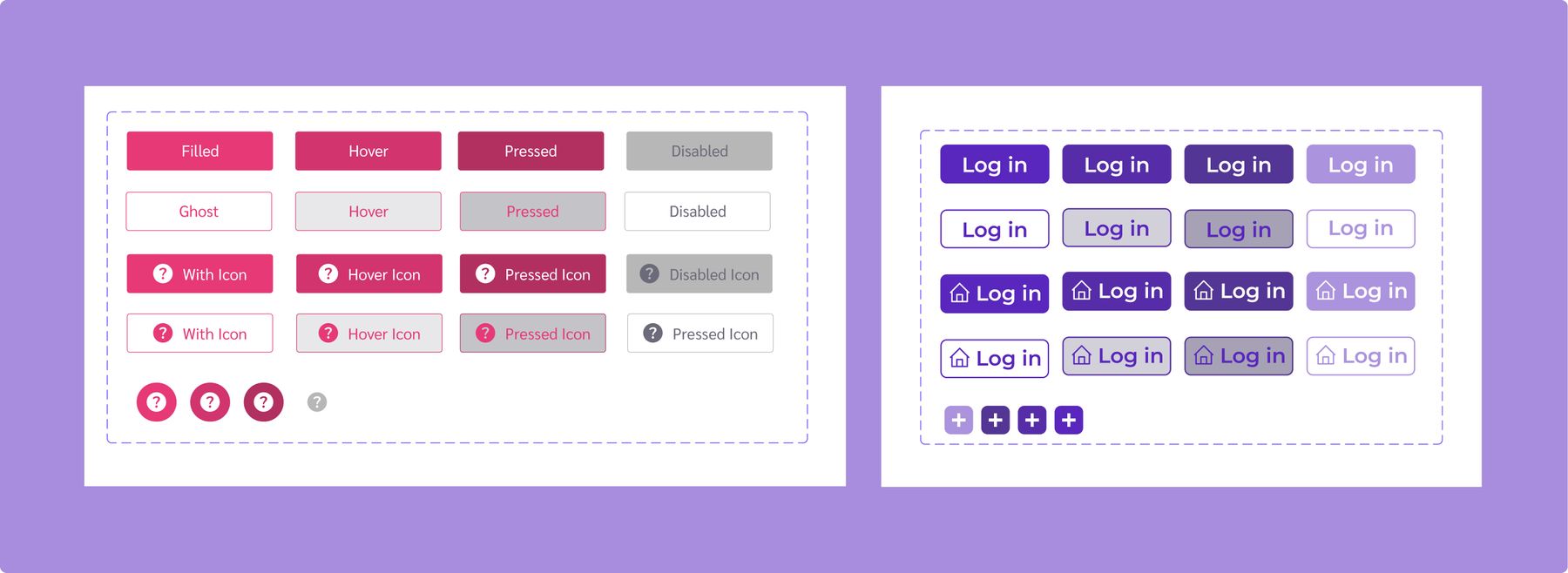
I mainly swapped the foundations from MIJO’s to Iris in our existing components and gave a simple cleanup to some.
This allowed me to focus on more robust components like
forms.
Auto-layout was still pretty new, so some components had it but not everything.
Illustrations
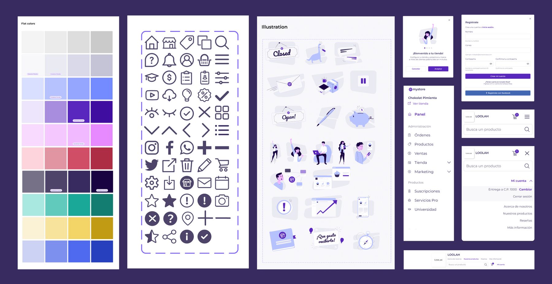
To keep with the cleaner look, Iris' illustrations were super simple, and flat and used mainly pastel colors, this allowed the team to create them really easily.
The end result
Given that we needed to launch My Store’s MVP as quickly as possible, Iris was made in a very small timeframe(1 1/2 weeks), but, since I already had the experience of creating Mijo and used it as a blueprint, it allowed me to add a lot of many other molecules and template components that allowed us to created landing pages and dashboards incredible quick.


