Mijo
Canasta Rosa's Design System.
Reading time: 3 minute(s).
The challenge
Canasta Rosa was an artisan e-commerce.
As it became a household name for e-commerce in Mexico, we needed to
expand from only having a site to also having a mobile app, but, since
the former one was developed by an external agency, it offered a
completely different look and experience to the users than the
website.
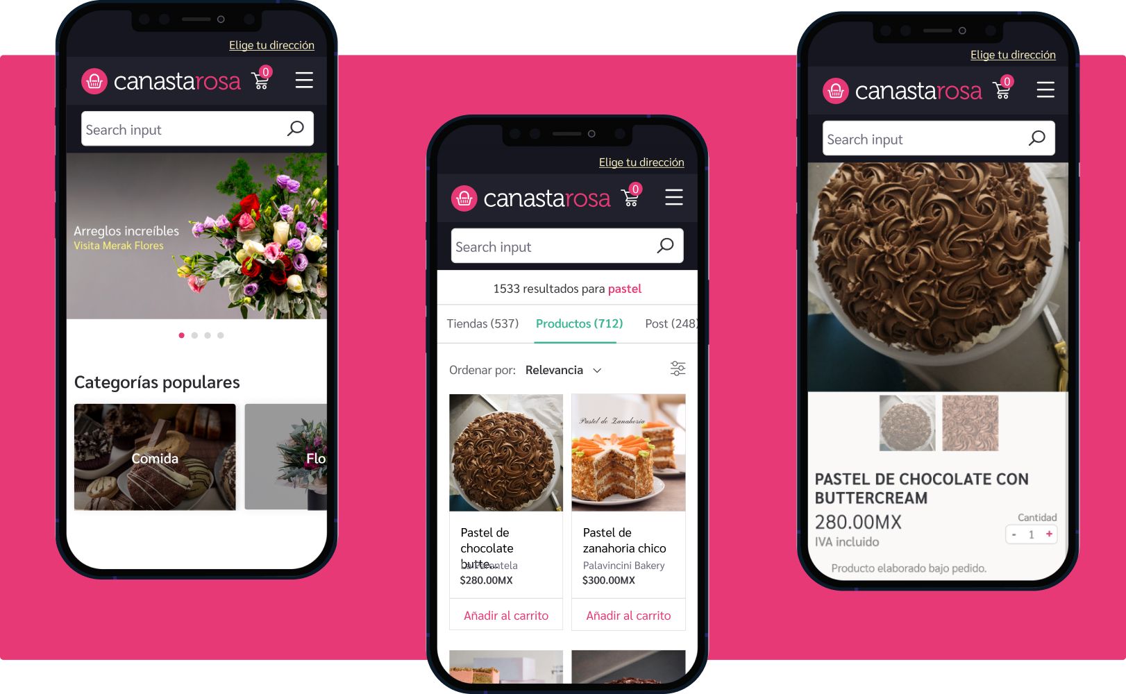
So we needed to unify the image and experience of a platform that would boost the reach and voice of small businesses during the pandemic.
The basics
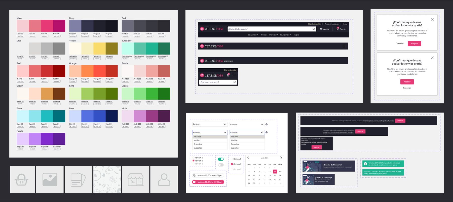
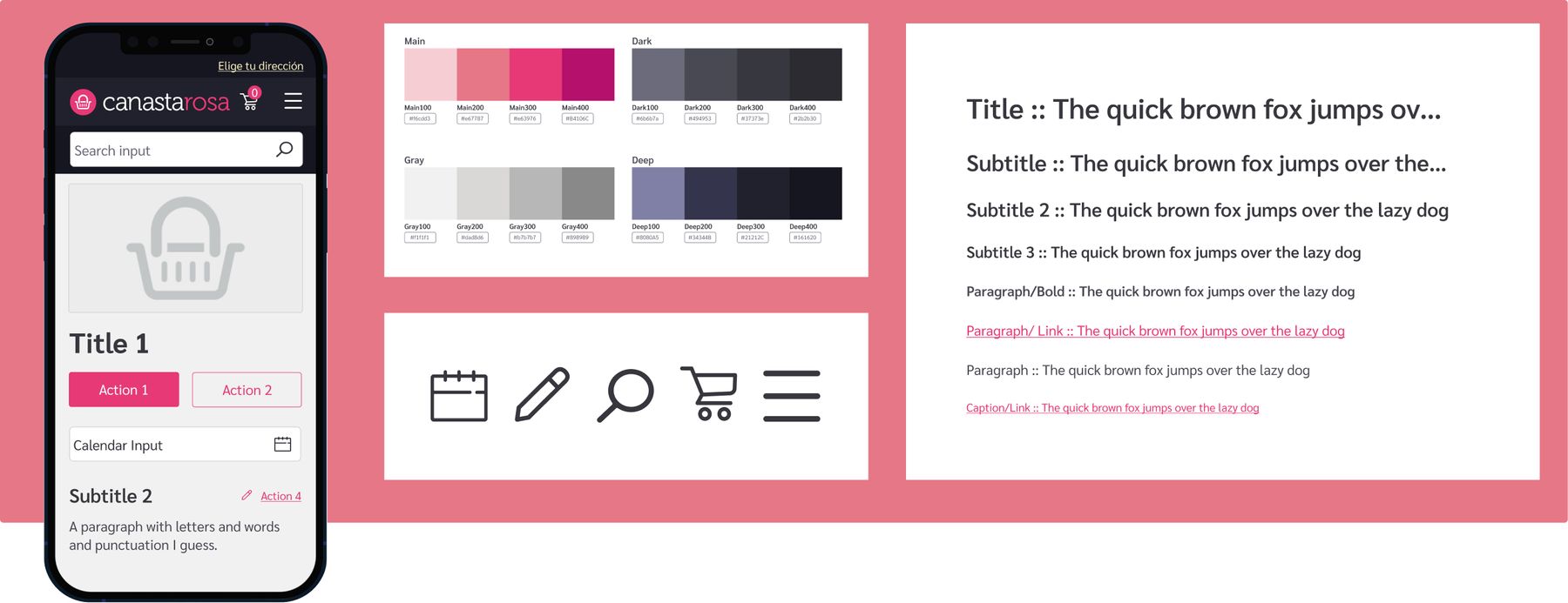
The first thing we needed to do was unify our first atoms: colors, text styles, and icons.
-
For colors , I took every color we were using in both platforms and grouped them in shades.
-
For text styles , I started to create a hierarchy based on the text styles we had in production with some tweaks.
- For icons , we try to use a very rounded style to make the icons more friendly.
The components
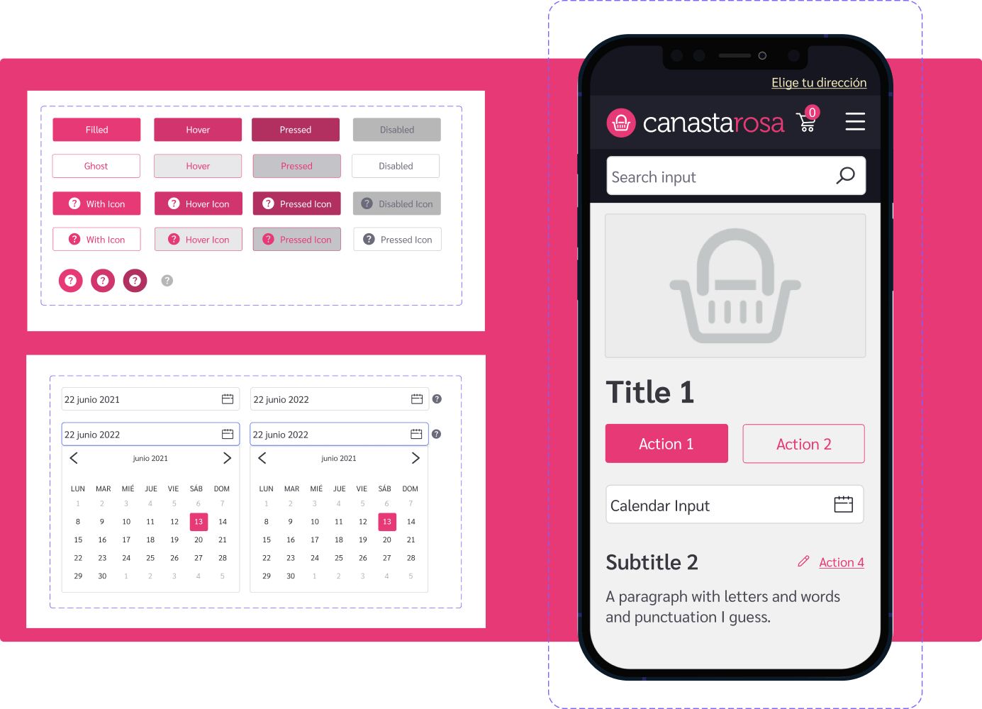
Once we created the basic building blocks of our UI, we needed to create new components from scratch. I would often spend some time of my sprint doing so, from simple inputs like buttons , to complex ones like navigation bars , but as time passed and the system grew, other designers and devs started adding their own components.
Unifying our workflow
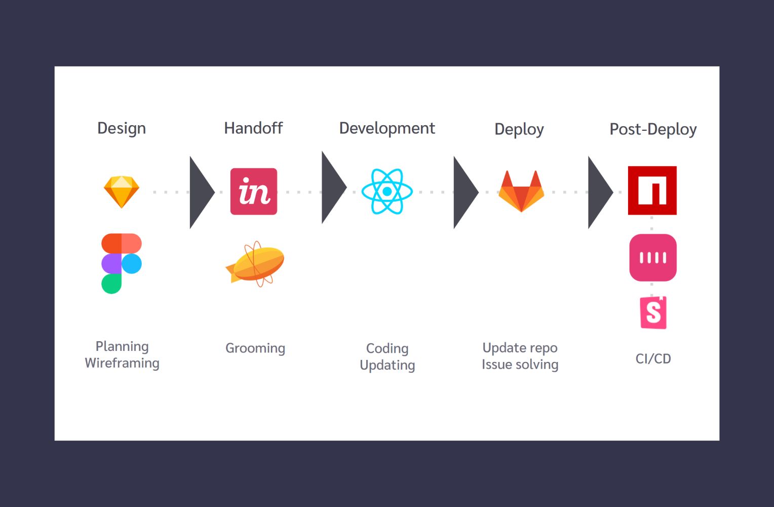
Once the DS started to gain traction, I optimized the workflow of adding things to the Design System via Sketch plugins like AirBnB's react-sketchapp for using the same coded component in Sketch, Figma, React and React native.
And, once every component was unified, I deployed a Storybook site to work as our single source of truth.
The end result
With an unified workflow, every component that we created was released on every platform at once. And we could create and redesign features super easily and fast, since designers and devs were, in a way, speaking the same language.
